Hotelplan Booking Tool.
UI Refresh for Booking Tool.
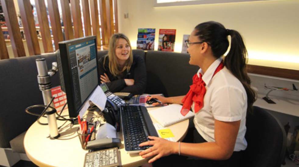
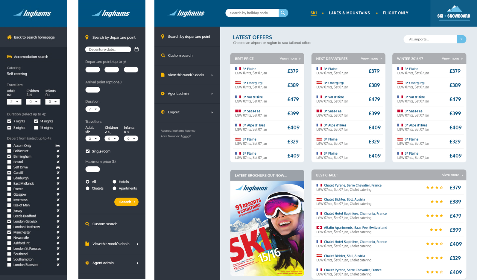
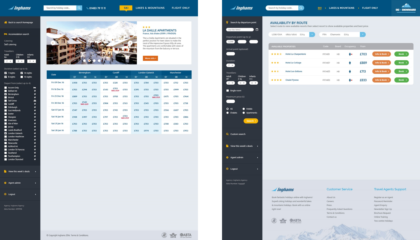
This update to Hotelplans Travel Agents booking tool not only improved the usability, it also added value to the booking process. Travel agents no longer hid their screens from customers, they actively invited them to view the screens and be involved in the booking.
The new screens increased the space between UI elements making it easier to understand. The colours used were reduced from 7 to grey, yellow and white thus simplifying and removing clutter for the Travel Agent.
Client
Position
Digital Designer
Activities
UI Design.
Category
Web


